Making of comic 489, frame 1
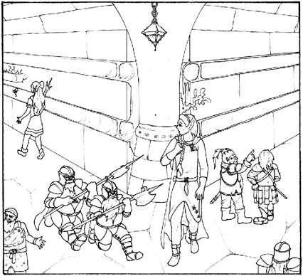 |
This is the scan after cleaning it up by narrowing the levels (to remove paper grain and blacken the ink lines) and cropping. These days I work at a resolution of 5648x3616 pixels for the entire comic. The images on the left here are shrunk to about 20% (so I work at a size five times as large). The original was drawn and inked on an A3 paper by alien. The line art becomes a layer in photoshop which is set to "multiply" mode (which means that you can see the layers below it through the white parts). |
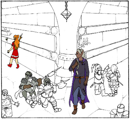 |
I start with flat-colouring everything. I do this on several layers which are on top of eachother and I start on the topmost layer. The topmost colour layer is nearly always the character layer (if there's much overlap, I will have multiple character layers). This way when I'm colouring the background layers I don't have to worry about painting over the characters. Flat-colouring is done using the flood-fill tool and a brush in "behind" mode (this draws only on transparent areas). Useful shortcuts: B (brush), E (eraser) G (fill), alt (colour sample), shift (draw straight lines). |
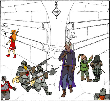 |
I have sets of colour swatches for every primary and most secondary characters that make it easy to keep recurring characters somewhat consistent. These swatches are labeled descriptively, for example one colour would be "Jael robes primary" and another "Jael gloves and boots". Some lesser characters don't have swatches, which means I have to open up an old comic they are in, hide all the shading and use the colour sampler tool (alt-click with fill or brush tool). New characters and extras get made up on the spot. |
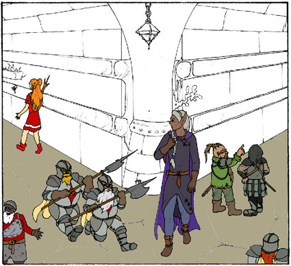 |
After the characters are flat-coloured, I move on to the backgrounds. I tend to have four to eight background layers, depending on the complexity of the background. They are selected mostly based on how separate I want them to have for the shading. For example the floor needs very different shading to the walls (and shadows have a "break" there) so it gets its own layer. In this frame there's the following colour layers: Characters, background: Floor, Background: walls1, Background: Walls2, Background: Walls3, Background: Misc I usually start with the floor and then move to other areas with large flat undetailed areas. This makes it easier since for the layers below these I don't have to worry as much about colouring within the lines. |
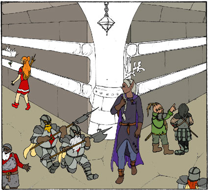 |
For background I don't have colour swatches so I have to sample from older strips. Usually though there's only a few strips in the same area, so most of the time I'm making up new colours. To do this, I have the colour palette set to "HSB" (Hue, Saturation, Brightness) mode. This lets me easily select complementary colours or get a slightly darker/brighter/more vivid/muted tone. Sometimes after I'm done with a frame I'll decide a certain colour doesn't work. In those cases I'll use the colour replace function (image->adjust->Replace colour) to find a more pleasing alternative. |
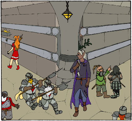 |
Here's the final flat-coloured version of the frame. Of course, when colouring I don't work on a frame per frame basis but on the entire comic as a whole. Waht I do is take the wall colour and fill that same wall in all the frames, then move to the next element (say a door) and colour that in all the frames. Otherwise I'd have to do a lot of sampling which is just annoying. Fun fact: there's no real gray in the background of this frame. All the colours you see as gray are just very desaturated. The walls are desaturated brown-red (earthy) and the metally bits are desaturated blue-cyan. People always think rocks are gray, but true neutral-gray backgrounds look weird. |
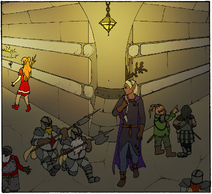 |
Here's a little trick to quickly get rid of the flatness in the backgrounds. What I have here is a layer on top of all the colour layers (but below the line art layer) which is set to "hard light" blending mode and is filled with (radial) gradients going from a colour to black. Hard light mode can both lighten or darken the layers below it and is good to fake some lighting. For indoor scenes lit with torches (like these) I have the layer set to about 60% opacity and the gradients going from bright yellow-orange to black. For outdoor scenes I'd use a 40% opacity and gradients going from yellow-white to black (same brightness, much lower saturation). If there's multiple lightsources I combine gradients by setting the gradient tool to "screen" mode. |
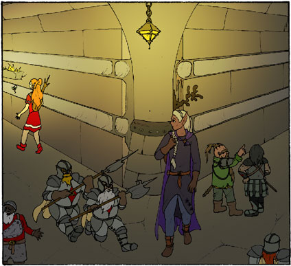 |
The trick above also darkened and lit our characters, but these tend to have more complex topography than backgrounds so we'll shade those differently. I exclude the characters from the lighting layer by ctrl-clicking the character colour layer and then making a mid-gray layer mask for this selection (P.S: if you want to know any of these steps in more detail, just pester me on the forum). |
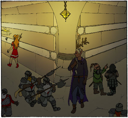 |
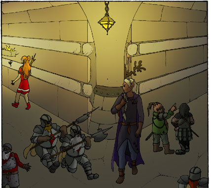
After brightening the characters some in the last step, I darken them again. This time I do it by adding, in photoshop jargon, a curves adjustment layer grouped with the character colour layer (making the character layer the clipping layer for the curves). What this means is that I add a darkening effect that applies only to the character layer and which I can adjust independently. I make the curve so that the result would show the characters as if lit only by ambient (non-direct, surrounding) light. (In this case, I made it too dark and at a later point I adjust the curve again to make it brighter once more) |
 |
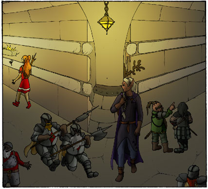
Here's the first of the actual shading. Using a brush with a medium-hard edge I paint on the layer mask of the curves layer, thus removing the darkening effect from those areas I deem to be in direct light. I use a brush which is pressure-adjusted (using a wacom tablet and pen) to opacity and with constant size. |
 |
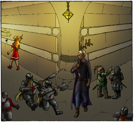
After the above has created a few highlights, I add some more shadows. Where the curves shade based on where light falls, I now focus more on accentuating shadows and giving everything a more three-dimensional appearance. These shadows are drawn using a soft, low-opacity (with pressure sensitivity) brush and bright, desaturated colours. The shadows layer itself is set to "color burn" blending mode and grouped with the character layer. This mode creates vibrant and colourful shading, but cannot affect very saturated layers (like rhyme's primary-colour dress). For those, we need the curves layer. For this reason I tend toward more muted base colours these days. Sometimes it's needed to isolate an area with the magic wand so the shading does not affect surrounding areas. More useful shortcuts: R (blur), W (Magic wand), shift+F3 (on my system, due to custom actions: expand selection 3 pixels) |
 |
Next up is teh highlights. Done in exactly the same way as the shadows but using darker colours and a layer set to "color dodge". Color dodge highlights are especially well suited to metals and hair but using darker coloured brushes can be used for most other materials too. In general I use a smaller brush for the highlights than for the shadows. |
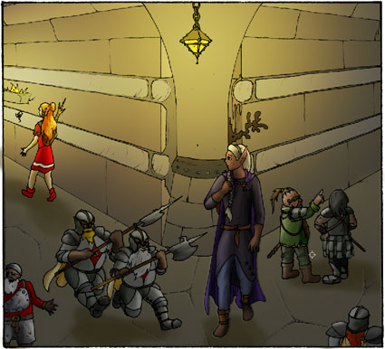 |
Next up is the shading of the background layers. A lot of this is already faked by the hard light gradients we added earlier. Here I've just added shadows to the floor underneath the characters. |
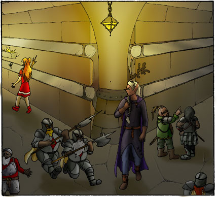 |
And here I've done the color burn/color dodge shading for the background layers. Note the metalic banding on the strips against the walls, made by diagonal lines on the shadows and highlights layers. to make that easier, those strips are on a different layer than the rest of the wall (because I knew they'd have to be shaded differently). |
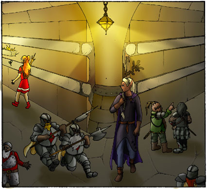 |
Here I just added some fancy lightbeams. These were made by creating a new layer on top of everything, set to "screen" blending mode at about 60% opacity. In this layer I made two triangular selections with the polygonal lasso tool and filled those with a radial gradient going from yellow to black, starting at the lamp. I then changed the selection to the entire frame and applied a weak radial blur (which curved the beam some) and then a gaussian blur to soften the edges. |
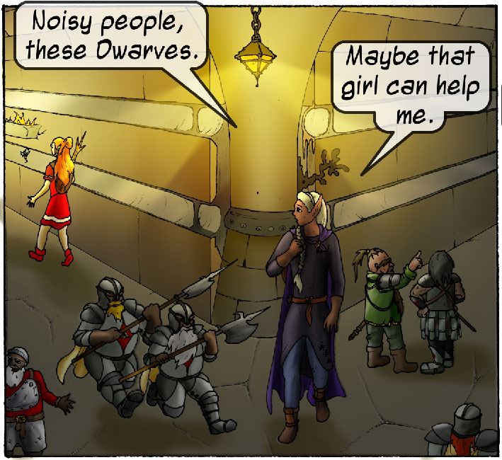


Comments
Roughly how much time do you spend on such a page ?
Now all I have to do is learn how to draw the same character a few times over, and I can make a webcomic of my own ;)
Thanks!
Add your own comment: